Year-Round Landscaping Made Simple
By Celia Fairchild / May 24
Color is more than just a visual element; it’s a powerful design tool that can transform outdoor spaces into cohesive, inviting havens. Understanding the significance of a unified color palette is essential for creating gardens that resonate with both beauty and emotion. Ready to elevate your outdoor design? Let's explore the key takeaways!
Understanding how different colors affect outdoor design can enhance the beauty and functionality of your garden.
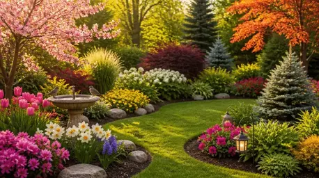
Colors like blue and green create a sense of calm and tranquility in outdoor spaces.
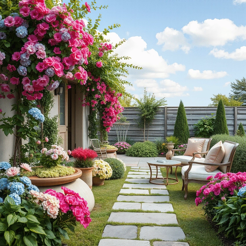
Warm colors like red and orange invoke energy and vibrancy, making spaces feel lively.
A cohesive color palette can evoke emotions, creating environments that resonate with users.
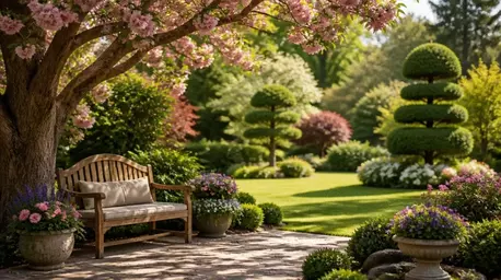
Different colors enhance garden beauty throughout the seasons, keeping it vibrant year-round.
A balanced color palette creates harmony, enhancing the visual appeal of outdoor spaces.
Choosing colors that reflect personal style fosters a sense of belonging in outdoor spaces.
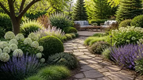
When it comes to designing an outdoor space, the colors we choose play a crucial role in how our gardens feel and function. A unified color palette brings together various elements, including plants, hardscapes, and furniture, to create a harmonious look. This unity not only enhances the beauty of your yard but also establishes a sense of cohesiveness that can make any space feel more inviting! For more ideas on how to elevate your surroundings, consider elegant landscaping with decorative trees.
One way to visualize this is to think about a beautifully arranged bouquet. Each flower contributes its unique hue, yet together they create a delightful composition. Similarly, in outdoor design, colors can either clash or complement one another. That’s why selecting a thoughtful color palette is essential for achieving an aesthetically pleasing garden!
Color is one of the most powerful tools in a landscape designer's toolbox. It can guide the eye, evoke emotions, and even influence how we experience a space. For instance, cool colors like blue and green often create a sense of calm, while warm colors such as red and orange can energize and invigorate. As a landscape designer, I find that understanding the role of color helps in creating areas that resonate with homeowners' personal styles.
Here are some key aspects of color in outdoor design to consider:
Have you ever walked into a garden and felt instantly relaxed? This is often due to the thoughtful use of color. A cohesive color palette can evoke certain feelings and create an emotional atmosphere that resonates with those who enter your space. For example, tranquil greens and soft blues can promote relaxation, while vibrant yellows and oranges can inspire joy and energy.
To effectively harness the emotional impact of color, consider these points:
As you embark on your landscaping journey, remember that color is not just about aesthetics—it's about creating a space that resonates with you and your loved ones. At Ornamental Yard, I’m here to guide you through every step of the process, helping you discover the perfect palette that reflects your unique style and enhances your outdoor experience!
Here's a brief recap of the key points discussed so far:
As you embark on your journey to create a stunning outdoor space, it’s natural to have questions about choosing the right color palettes. At Ornamental Yard, we understand that the choices can feel overwhelming, especially when considering factors like climate or accessibility. Let’s dive into some common questions you might have regarding outdoor color palettes!
The climate in your area can significantly affect how colors appear and how they function in your garden. For instance, in hot climates, lighter colors can help reflect sunlight, keeping your outdoor areas cooler. Meanwhile, in cooler regions, richer, warmer tones can create a welcoming vibe and provide a sense of warmth.
These considerations will not only enhance the aesthetics of your space but also ensure that your plants thrive in their environment. Are you ready to see how these colors can reflect your unique style while being practical?
Absolutely! Designing an outdoor space that is accessible to everyone, including those with color vision deficiencies, is important. At Ornamental Yard, we believe in creating inclusive gardens that everyone can enjoy. Here are some tips to choose color schemes that work well:
By taking these steps, you can create a vibrant outdoor space that appeals to everyone, regardless of their color perception. Your garden can be a place of inclusivity and beauty!
Finding the right color palette for your outdoor space can be a fun and exciting process. Whether you’re looking to refresh your existing garden or start from scratch, there are countless resources available to help inspire you. At Ornamental Yard, we’re all about fostering creativity, so let’s explore some valuable tools and ideas!
There are many online tools and applications designed to help you choose the perfect color palette for your outdoor design. Here are a few that I’ve found particularly useful:
These tools will not only save you time but will also bring your ideas to life in new and exciting ways!
One of the most inspiring aspects of outdoor design is seeing real-world transformations. Consider visiting local gardens or checking out online galleries. You might find projects where color palettes have made a significant impact. Here are some ideas to inspire your creativity:
These examples can spark your imagination and guide you in visualizing your own outdoor oasis! Remember, every garden tells a story, and your color choices are a vital part of that narrative. For further inspiration, consider exploring how to enhance your garden with ornamentals.
Creating a mood board can be an effective way to visualize your outdoor color palette. Here are a few online resources that I recommend for putting together your design:
These resources make it easy to experiment with color combinations and see how they work together in your design. It’s all about bringing your vision to life, one color at a time!
Now that you’ve gathered insights and resources, I encourage you to dive in and start experimenting with your outdoor color palette! Don’t be afraid to play with different combinations until you find the perfect fit. Your outdoor space should be a reflection of your unique style and personality!
At Ornamental Yard, we love hearing from our community! Have you started your color journey? I invite you to share your experiences, images, or ideas about your outdoor palette. Engaging with fellow garden enthusiasts can provide great motivation and inspiration.
Color plays a crucial role in shaping the ambiance of your outdoor area. It can evoke feelings and set the mood, creating a welcoming environment that invites you to spend time outdoors. Remember, your garden is your own little haven, and adding the right colors can transform it into a personal retreat. Embrace the process, and enjoy creating a space that reflects your creativity and love for nature! To maintain the health and vibrancy of your colorful garden, don't forget to check out these essential tips for tree care.
Here is a quick recap of the important points discussed in the article:
By Celia Fairchild / May 24
By Celia Fairchild / May 16
By Celia Fairchild / May 10